While season 5 of Riverdale is short broadcast and the scenario no longer makes much sense, we can wonder what made the series a success. At its launch in 2017, the teen series was a great success with its fresh, mysterious and sexy scenario, giving a real facelift to the comics. The secret of its success lies not only in the plot or the casting but in the mastery of colors and light. 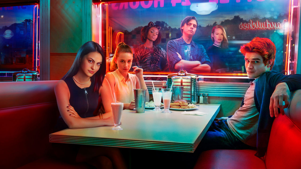 Developedby Roberto Aguirre-Sacasa and broadcast since January 26, 2017 on The CW, Riverdale is based on characters from the Archie comics. It also features other characters from the publisher Archie Comics such as Josie and the Pussycats or the Black Hood. A little reminder of the plot of the teen series: "In the small town of Riverdale, a new school year begins for Archie Andrews and his friends Betty, Jughead, and Kevin. But the inhabitants of the city see their daily lives turned upside down by the mysterious death of young Jason Blossom. While the secrets of each other threaten to rise to the surface, Veronica Lodge, freshly arrived from New York, makes a remarkable arrival in town. Nothing will ever be the same again in Riverdale… "
A mastery of light and colors by Brendan Uegama
In cinema as for series, the treatment of light and colors is the role of the director of photography. The latter uses complementary colors to make people or elements stand out on the screen. As the saying goes: "opposites attract". In cinema, it's the same, the opposing colors complement each other. For example, orange and blue or green and red. 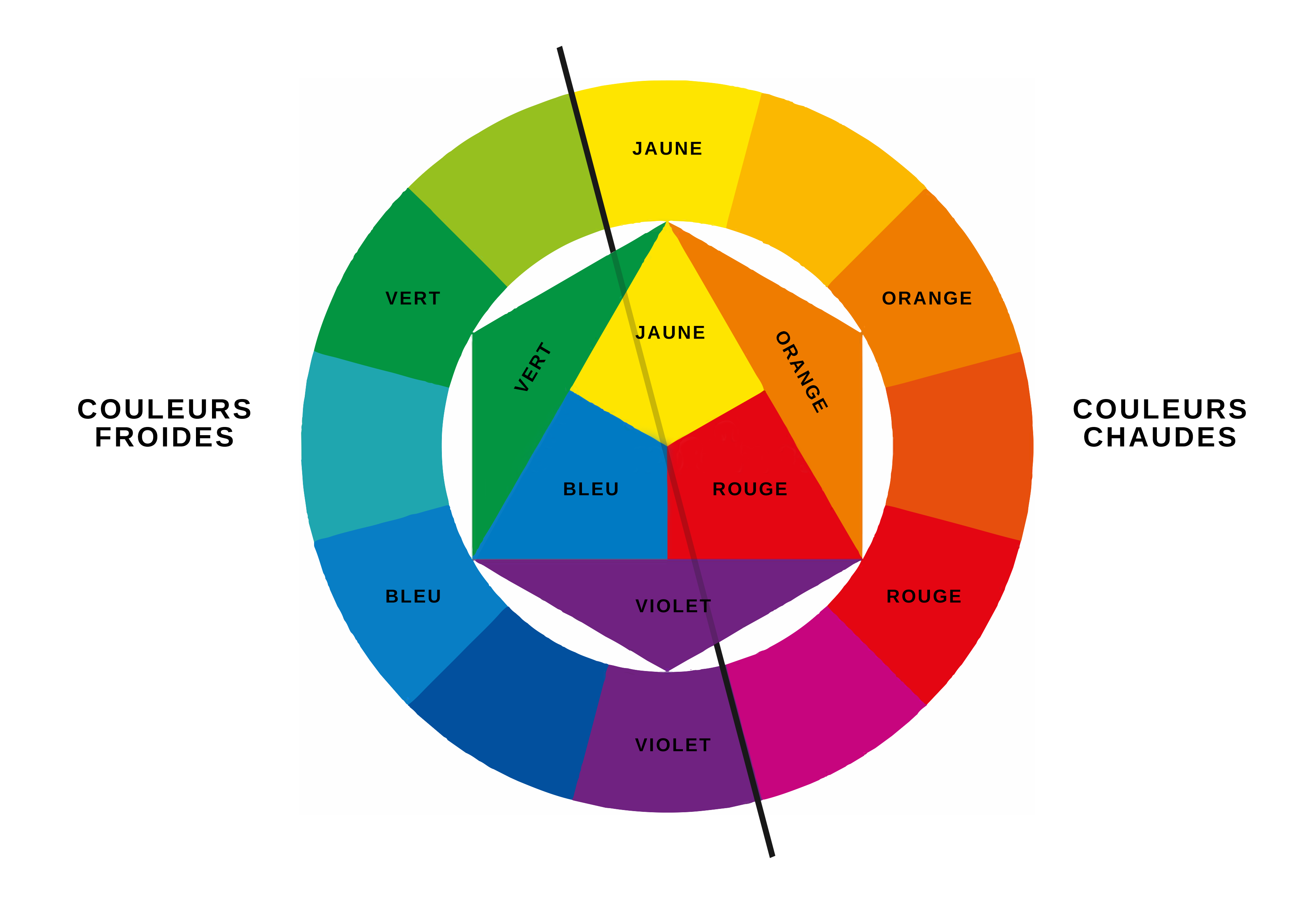 Even if for a few seasons, the series has lost quality, by the many inconsistencies of the scenario, the colors, on the other hand, are still impeccably treated. It is Brendan Uegama, the director of photography, who must be thanked for the flawless visuals of the series.
 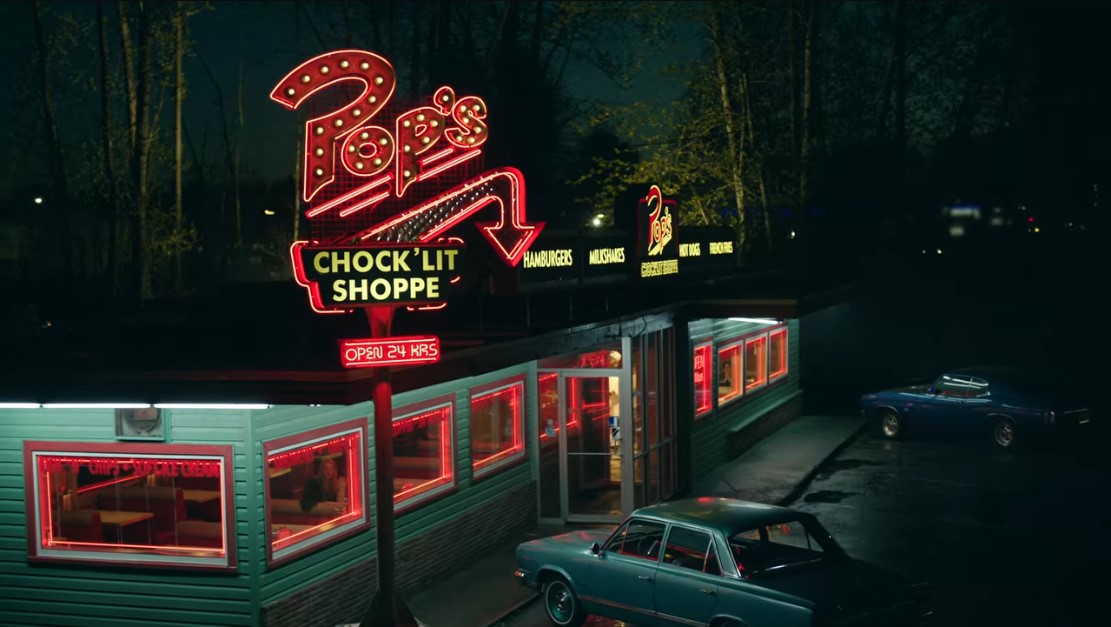 This wide shot, Archie and his friends' favorite "dinner", illustrates Brendan Uegama's impressive work and flawless aesthetic. Dark green, which is present in the majority of the plan, highlights the neon red signs. Green and red complement each other and the light of the night is perfectly mastered here.
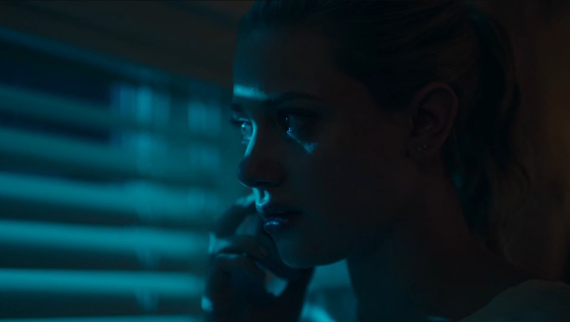
 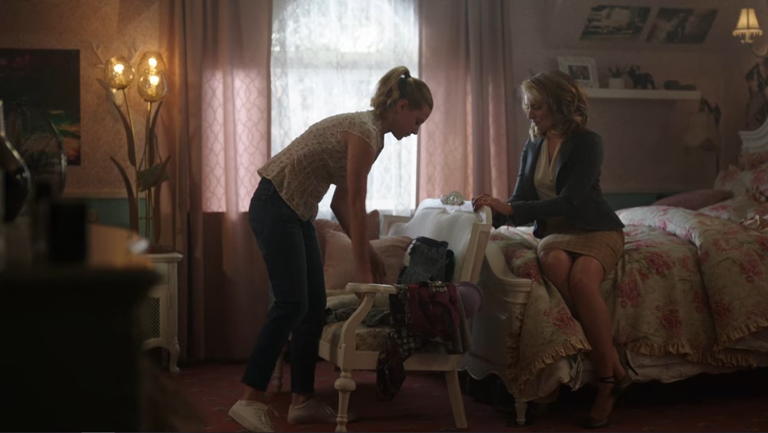 In the image above, Betty and her mother, Alice, are chatting in the teen's bedroom. The room is bathed in warm light, which is reinforced by the pink color of the walls, carpet and curtains. The atmosphere, induced by the light, is calm or even reassuring. Unlike the scene below, still in the young woman's room, where the colors are cold and the light dark. These elements amplify the tense and stressful atmosphere of the scene.
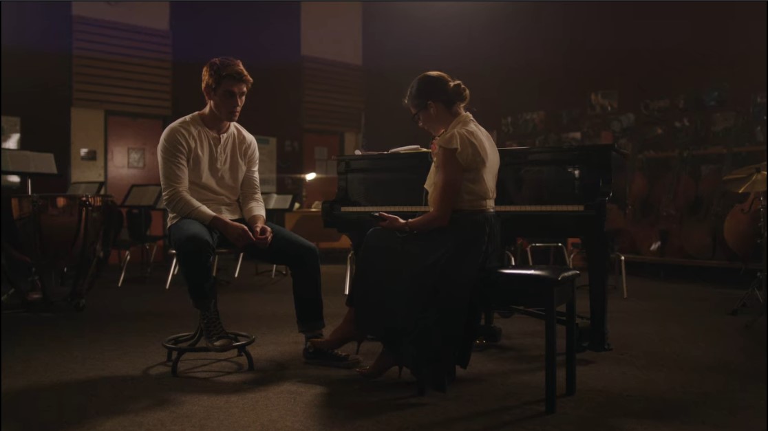
  In the image below, Archie and Mrs. Grundy listen to a demo that the young man composed. The subdued and warm light makes it possible to transcribe a pleasant and comfortable atmosphere that suggests romance. (The two have a history together).
Complementary colors in a few examples
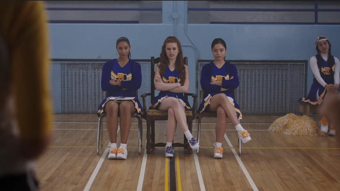
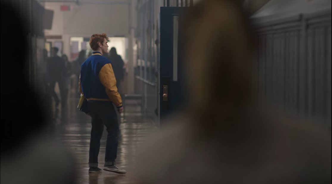
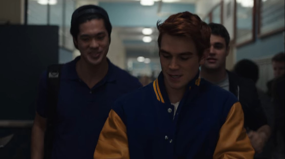
Blue and orange/yellow. This pair of colors is privileged in the series. These are, indeed, the colors of the high school and the uniform of the athletes. 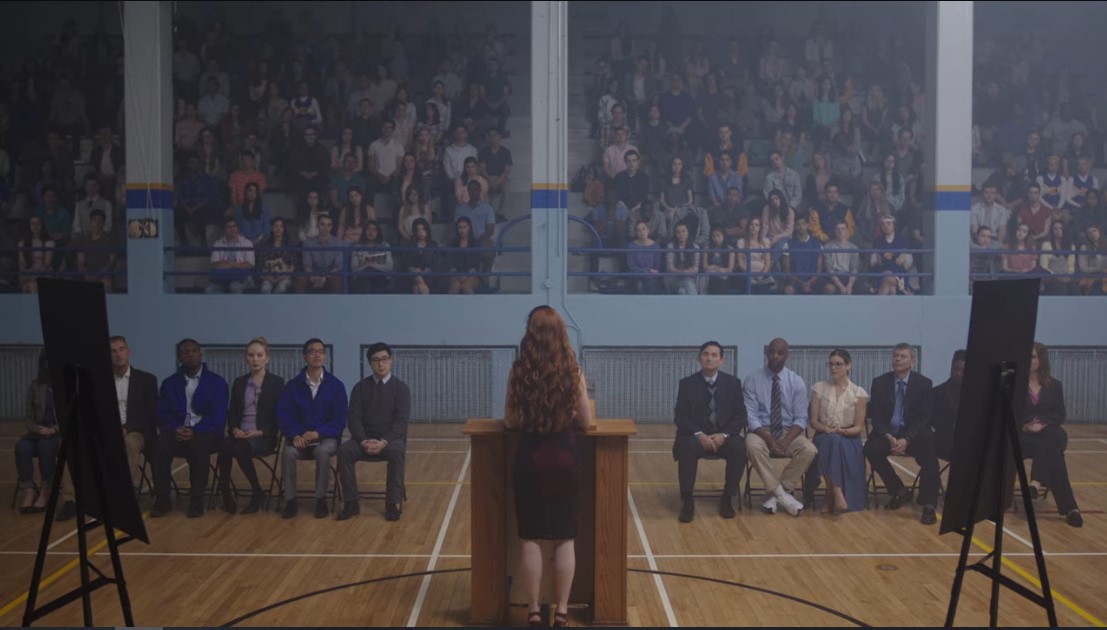
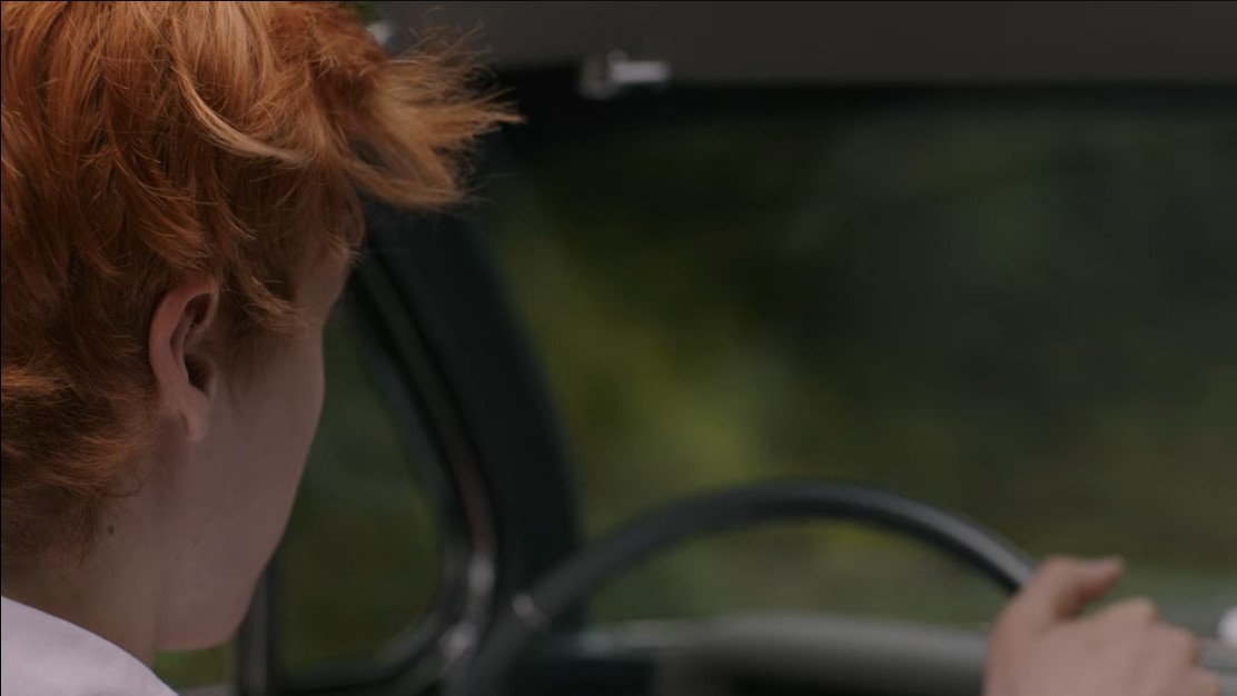
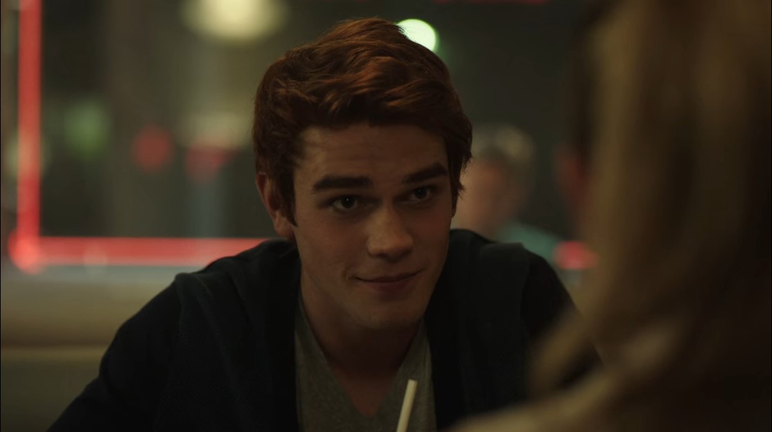
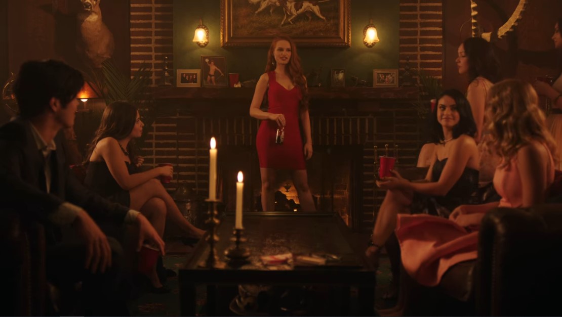
Green and red/orange. This colored pair is often exploited in the series. The main reason is the red hair color of two central characters of the series: Archie and Cheryl.

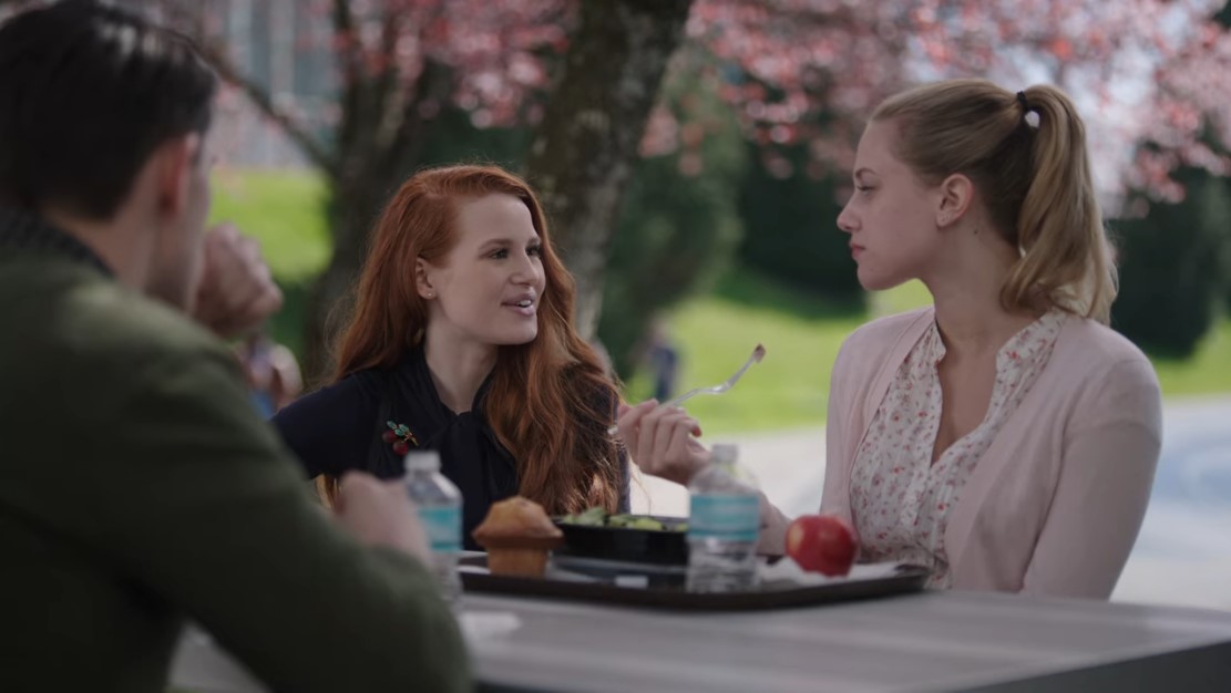
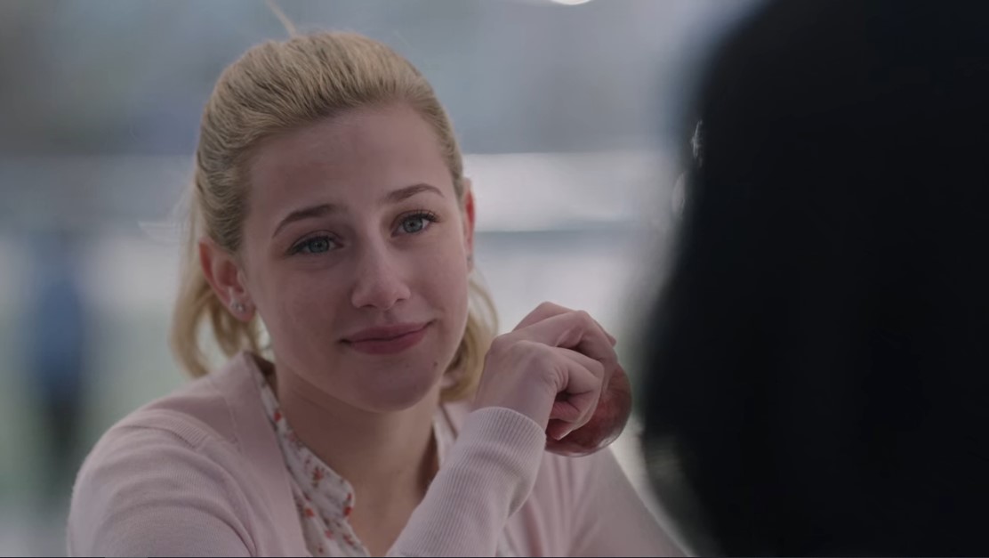
On this level, the complementarity of colors is obvious. Cheryl's red hair is highlighted by Kevin's green sweater in the foreground. While the green lawn in the background and the red apple reinforce this contrast and add a note of color to the scene.
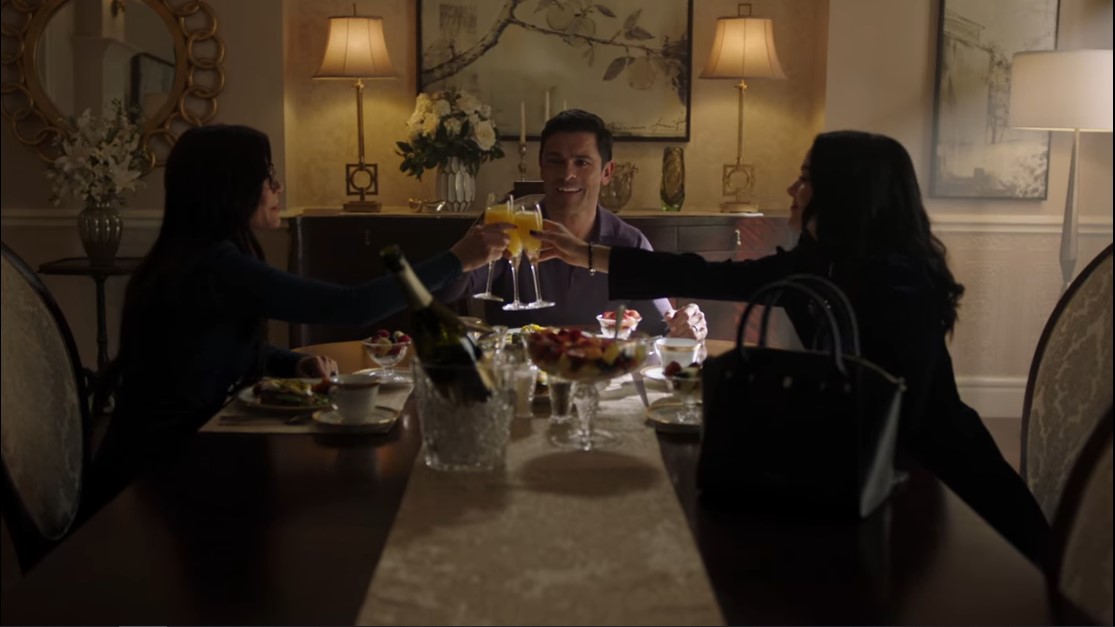
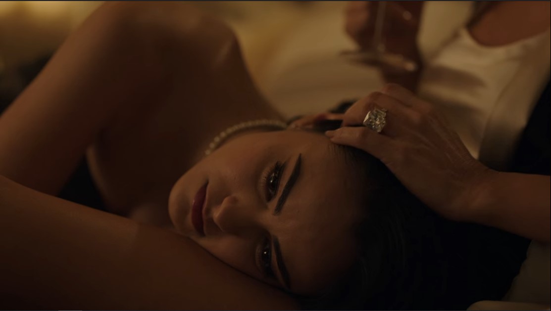
Black and white. This pair of color is particularly privileged in the shots featuring Veronica Lodge and her family. The three characters have brown hair, their apartment is naturally white to highlight them.


 You landed the Riverdale series, because the script became too incoherent? Despite the quality of the image processing? And you don't know what to watch? Do not hesitate to discover the top Netflix series of January according to the editorial staff Just Focus here.


![Sum’One sort la pépite électro Let It Snow et le EP Hello Vera Sum'One - Let It Snow [Official Video]](https://www.justfocus.fr/wp-content/uploads/2024/11/SumOne.jpg)


